Standard case study
Selah Coffee
Selah Coffee is a self-initiated concept project inspired by the kind of community-focused café I would one day like to create if given the opportunity.
- Project type
- Self-initiated concept project
- Categories
- Branding, Graphic Design, Print and Publishing, Web Development
- Focus
- Brand strategy, identity, digital design, and implementation
Project links
Project Overview
Selah Coffee is a self-initiated concept project inspired by the kind of community-focused café that I would one day like to create if given the opportunity. I developed the project as a comprehensive case study to demonstrate the breadth of my abilities as a multidisciplinary designer, from early concept development and brand strategy to digital design and implementation.
Tools Used
- Adobe Illustrator
- Adobe Photoshop
- Figma
- Notion
- Visual Studio Code
- ChatGPT and Codex
Skills Demonstrated
- Project management through a staged, iterative workflow
- Brand strategy and identity development
- Graphic design
- User experience design
- User interface design and prototyping
- Responsive web development
Phase 01 — Define the Experience
Creating a coffee shop centered on pause, reflection, and community.
While I was in school, I spent several years working in a coffee shop. That experience inspired me to imagine my ideal café: not only how it would look, but how it would feel to spend time there.
What would a coffee shop look and feel like if it were built around the people it serves?
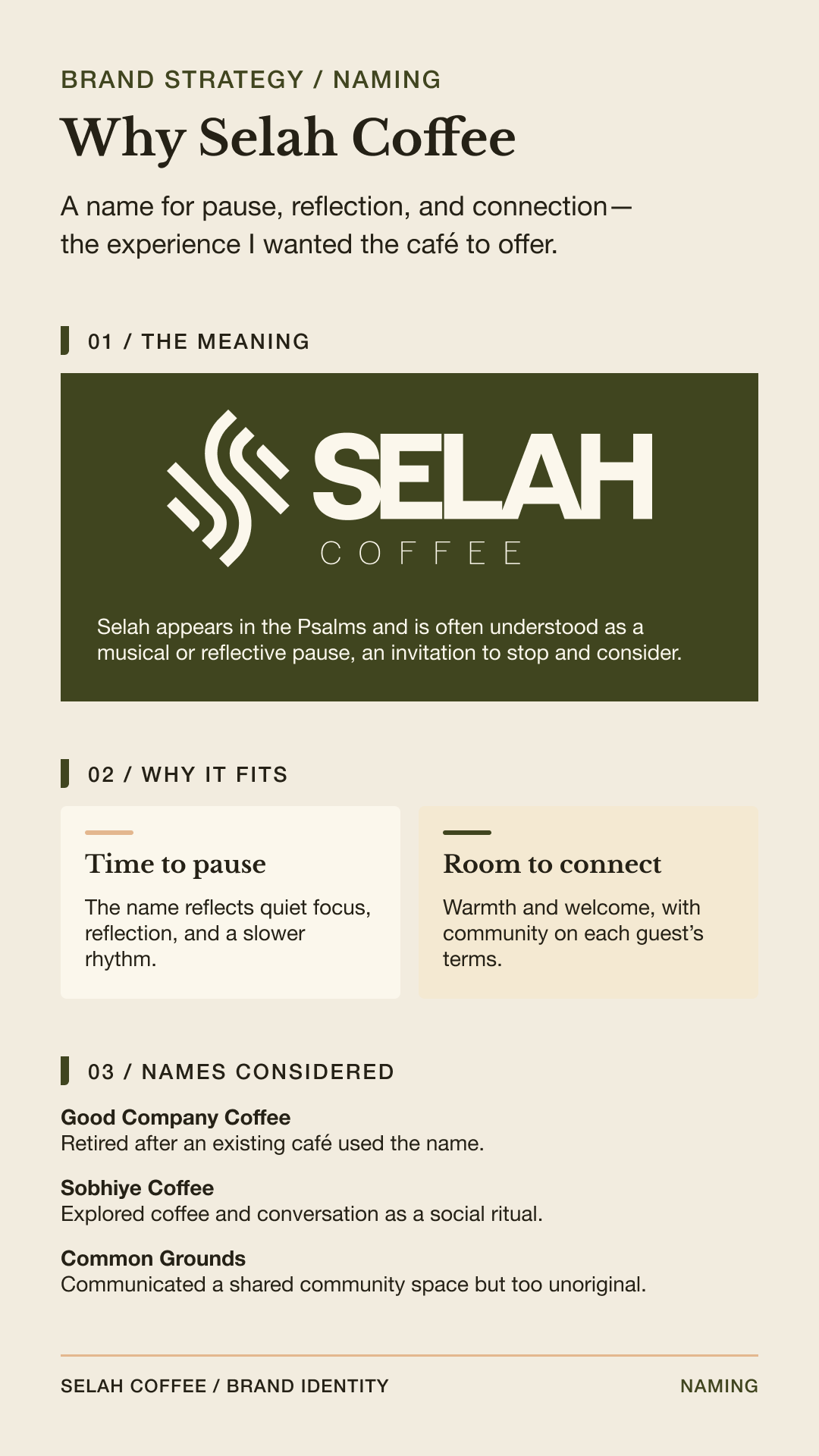
My answer was a community-focused shop designed to invite people to slow down, pause, reflect, and connect with others. Selah is a Hebrew word found throughout the Psalms. Often understood as a musical or reflective pause, it introduces a moment of rest in the cadence, an invitation to stop and consider. This idea became the foundation of the brand and guided the experience I wanted Selah Coffee to create.
Brand Identity Summary
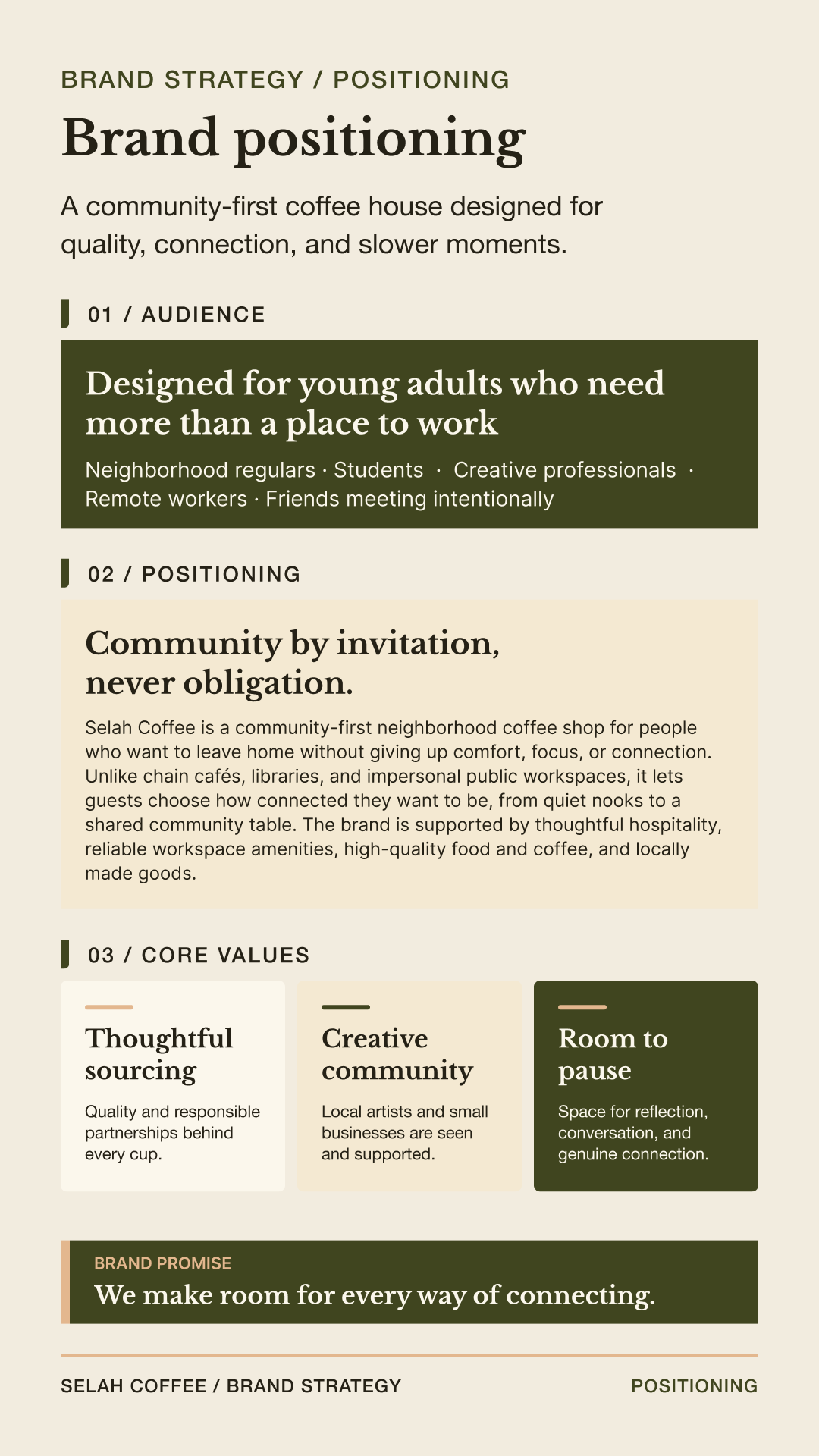
Selah Coffee is a community-first neighborhood coffee shop designed as a flexible place between home and work. It gives guests control over how they participate: they can work privately, enjoy the presence of others, meet around a shared table, or take part in community activities. The central idea is that community should be available without ever feeling required.
- Audience
- Primarily students, remote workers, and early-career professionals aged 18–35, while remaining welcoming to the broader neighborhood.
- Customer Need
- A comfortable place for sustained focus that still feels warm, social, and distinct from an office or coworking space.
- Positioning
- A community-first café where guests can choose their preferred balance of privacy and connection.
- Brand Promise
- “We make room for every way of connecting.”
- Strategic Principle
- “Community by invitation, never obligation.”
- Working Tagline
- “Start with coffee. Stay for company.”
- Call to Action
- “Find your place.”
- Core Values
- Hospitality, generosity, dignity, service, creative community, and care for neighbors.
Verbal Identity
The voice should feel:
- Warm and conversational
- Clear and unpretentious
- Calm without becoming solemn
- Invitational without pressuring people to participate
The brand should avoid corporate community jargon, unsupported sentimental claims, forced explanations of the name, and language that assumes every guest wants to socialize. Its Christian foundation is expressed through inclusive hospitality and ethical behavior rather than religious messaging.
Phase 02 — Build the Visual Identity
Translating the idea of intentional pause into a flexible visual system.
Logo Exploration
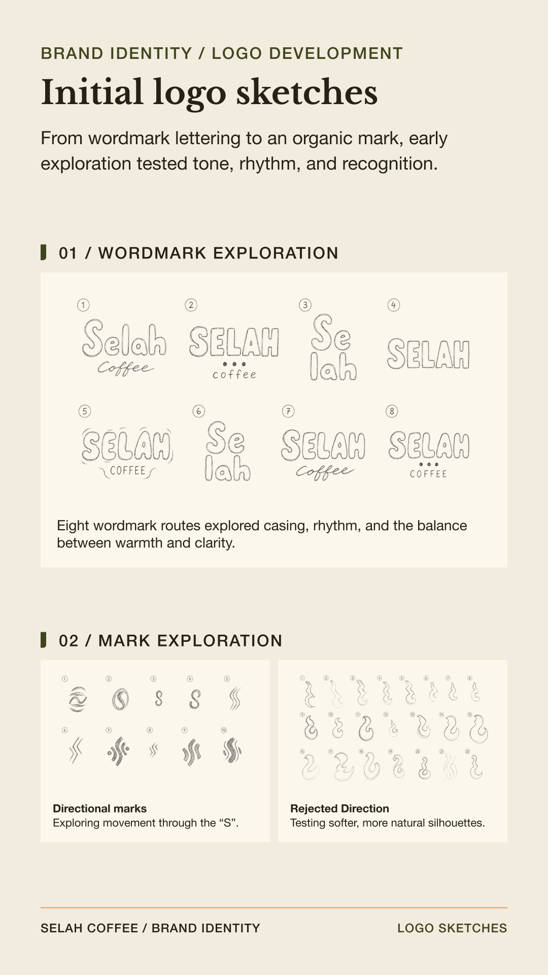
I learned a long time ago that your initial knee-jerk ideas for a logo are often unimaginative and generic. Once you start running out of ideas, the creative ones start to flow. When developing a logo, I sit down with a sketchpad and just draw everything that comes to mind. These are some of the early sketches that I made in this stage of the process:
After I have a couple of good options to work with, I move over to design software and start playing around with the general designs and then apply them to different things. At this point, I get feedback from different people and then move forward or go back to my sketchpad and repeat this cycle until I have a final product.
Final Logo Assets
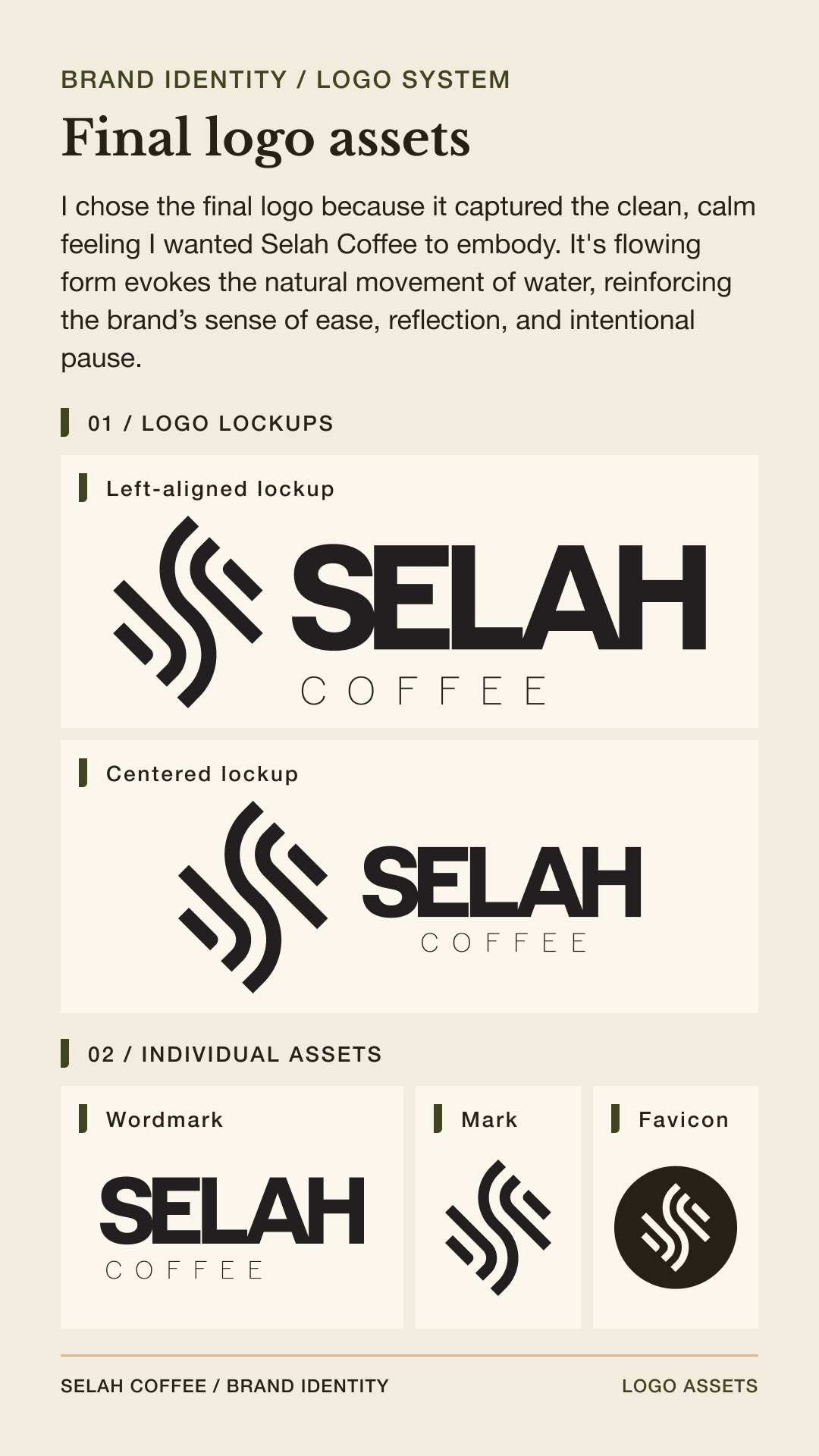
The final logo’s flowing form evokes the natural movement of water, reinforcing the brand’s sense of ease, reflection, and intentional pause. The system includes left-aligned and centered lockups, a standalone wordmark and mark, and a favicon.
Typography
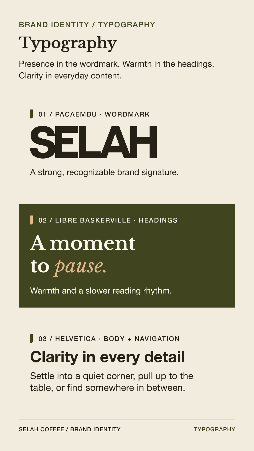
Selah Coffee’s typography balances personality with clarity. Pacaembu is reserved for the wordmark, giving the brand a distinctive and recognizable voice. Helvetica serves as the primary functional typeface across body copy, navigation, and interface elements, while Libre Baskerville is used selectively in expressive headings to introduce warmth and an editorial quality. Together, the typefaces create a system that feels approachable, refined, and easy to navigate.
- Pacaembu
- Helvetica
- Libre Baskerville
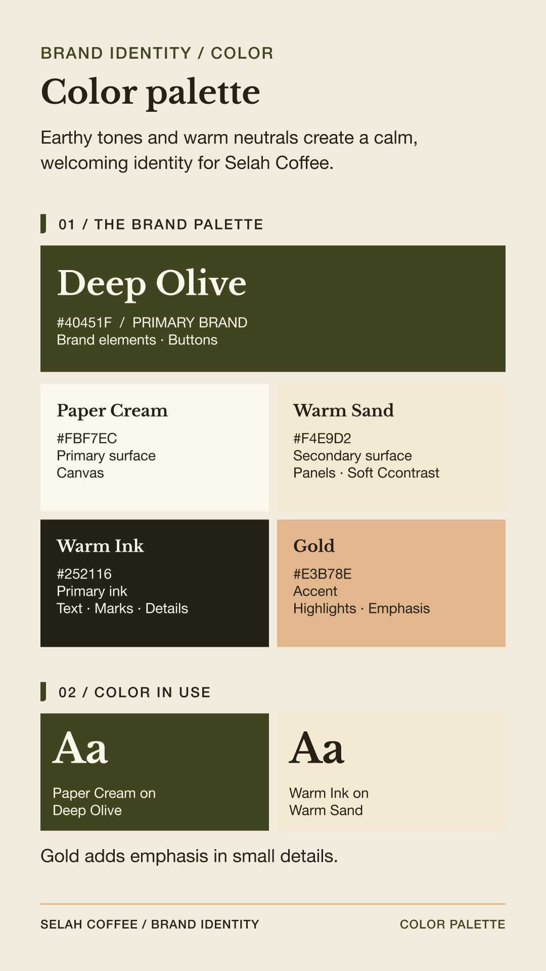
Colors
- Gold (#E3B78E): Accent and emphasis
- Warm Sand (#F4E9D2): Secondary warm surface
- Paper Cream (#FBF7EC): Primary background and light mark color
- Deep Olive (#40451F): Primary brand color, buttons, and dark surfaces
- Warm Ink (#252116): Primary text, marks, and fine details
Phase 03 — Apply the Brand
Testing the identity across physical customer touchpoints.
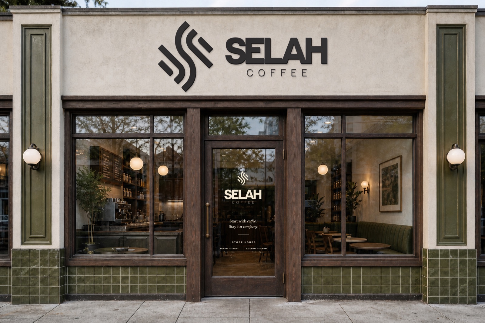
Once the core visual identity was established, I expanded it into a flexible collection of branded graphics and applications. This phase allowed me to test whether the identity could remain recognizable and consistent across different formats, materials, and scales.
Graphic System
I developed repeatable patterns, supporting graphics, and alternate logo configurations that could be adapted to a variety of brand materials. Each element was designed to work independently while still feeling connected to the larger visual identity.
Phase 04 — Design the Digital Experience
Creating a responsive website that carries the atmosphere of the café online.
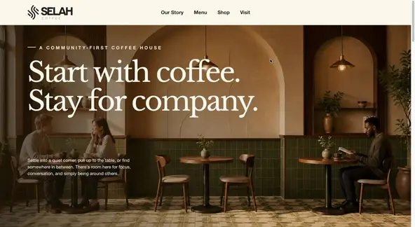
For this project, I decided to experiment with a new workflow using emerging technologies to accelerate website development.
Instead of manually coding the HTML and CSS for a static version of the site, I used ChatGPT Codex to help translate my Figma prototype into a fully functioning website. Here’s a breakdown of my process, and what I learned about AI-assisted design and development.
1. Prototyping
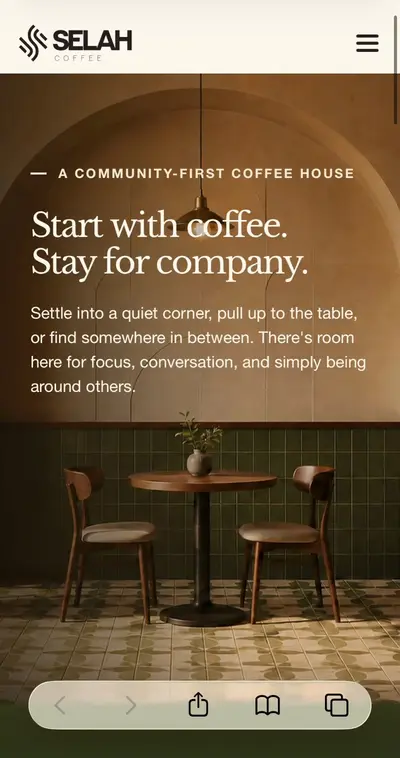
- Designed responsive desktop and mobile layouts in Figma.
- Created a detailed representation of the final experience, including spacing, behavior, and how the layout should adapt across screen sizes.
2. Prototype to Responsive Website
- Once the Figma prototype was complete, I brought it into ChatGPT Codex to see how effectively it could translate the design into code.
- The initial results were mixed. The generated files required significant cleanup and reorganization before I could begin fine-tuning the layout and spacing.
- I restructured the HTML and CSS using modular sections, consistent class names, reusable root styles, an indexed table of contents, and a more predictable hierarchy.
- This modular structure will also make the site easier to convert into a dynamic CMS template.
The final result is a responsive, single-page static website that functions as an advanced, interactive prototype.
Key Takeaways
AI can do an impressive job, most of the time. It can accelerate large parts of the design and development process, but it still requires thoughtful direction, technical knowledge, and human judgment.
The tool can help you move faster, but knowing how to evaluate, organize, and refine its output is what turns generated code into a successful final product.
Project Reflection
I took on this project to create a portfolio piece that reflected the full breadth of my abilities as a multidisciplinary designer. I chose to develop a coffee shop concept because I spent several years working at Starbucks while completing my education. During that time, I often found myself imagining the kind of café I would create and the experience I would want it to offer. Combined with my genuine love of coffee, this personal connection made the subject a natural choice.
I used this project as an opportunity to experiment with AI-assisted workflows and better understand their strengths and limitations. AI helped me stay organized and accelerated parts of the process that would normally require significantly more time. If I were to continue developing the project, I would conduct additional user testing, further refine the prototypes, and ultimately build a dynamic website using a headless CMS architecture.